Features Overview
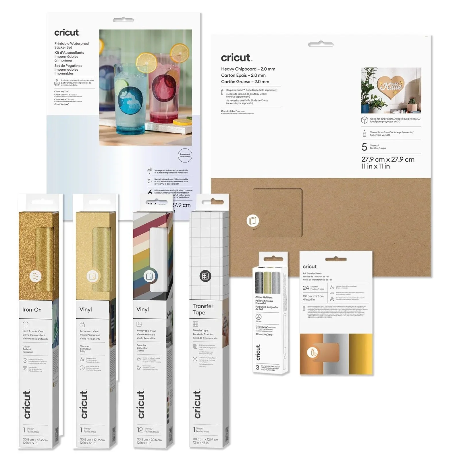
consumables packaging
The ask here was to showcase Cricut materials in new more sustainable packaging. The main focus was using a custom die-cut for the window to show the material. The dats shows that consumers shop by color first, then choose material types etc.
Creating a shape that incorporates the circle icon for each material as part of the die-cut made it possible to patent the design.
the end result provides an easy way to shop by color and also create a beautiful in store presence when shopping for Cricut brand materials.
icons & lineart
I have been able to work on an icon library that is used across the visual design team and the UX team. The cross team coordination has allowed us to make sure we are using the same icons for physical and software needs to create a clear system of communication.
I have been able to create line-art for machines and other products. Another task is to illustrated difficult instructions with little or no text to be used for International needs.
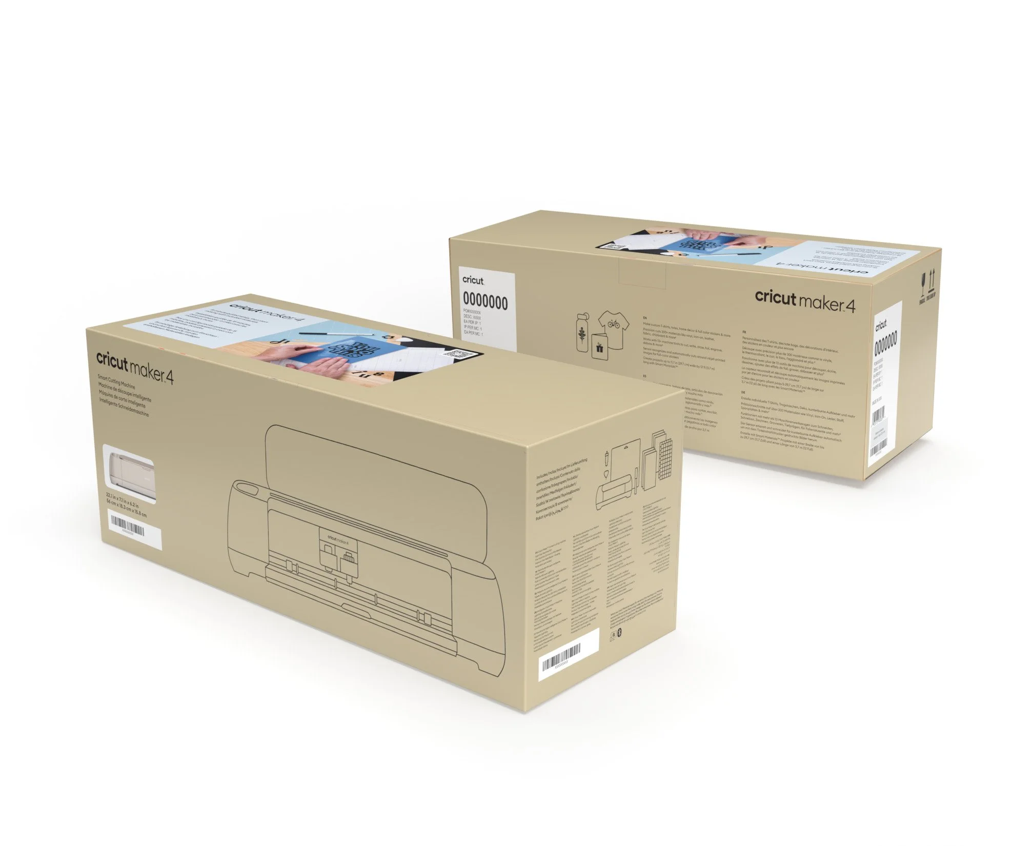
Machine packaging
As Cricut moves to a more international audience the need arose to create more cost effective packaging that can go into as many countries as possible.
The ask was to take our full-color printed machine box and create a simplified version that could be printed in mass, and accommodate the needs of different countries, regions and legal regulations by adding stickers for each specialized need.
Another goal was also to eliminate waste by shipping the machine box in the display box as one unit (instead of a box in a shipper).
This required a lot of communication with legal, compliance, international partners and engineering.